So, you found out that your style is contemporary! Contemporary style is all about minimal accessories, smooth forms, and strong lines (of course, rules are created to be broken from time to time!).
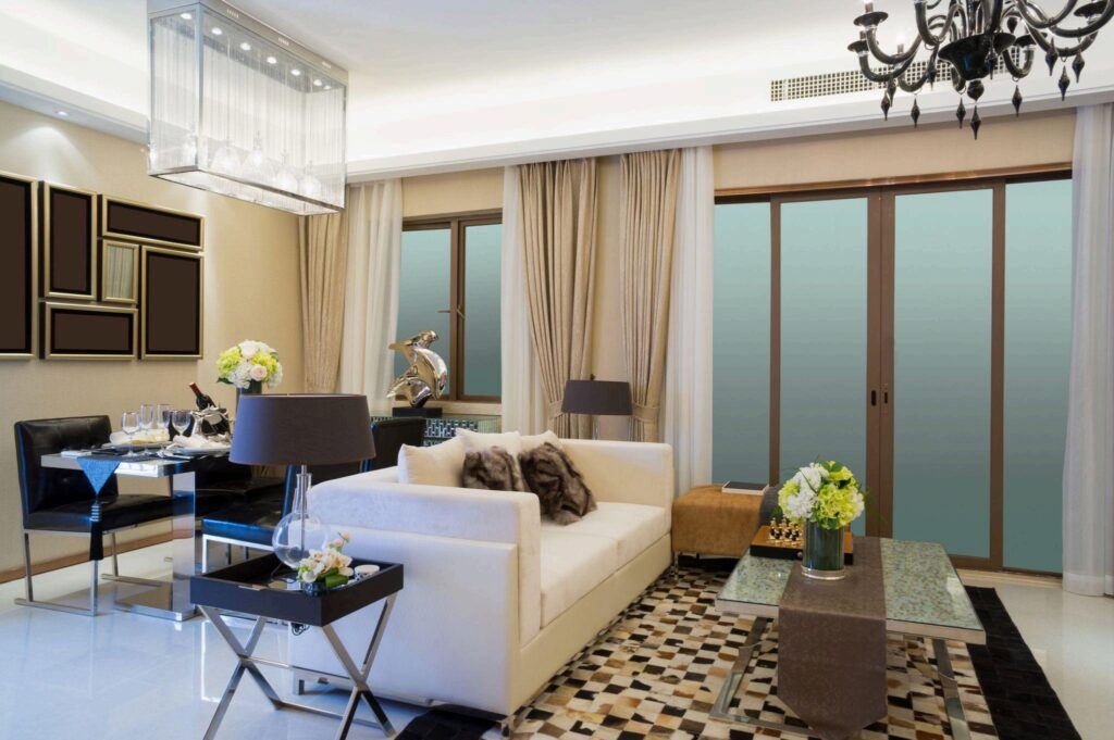
What is contemporary style?
Contemporary design marks a shift from traditional decor, focusing on the present. This style emphasizes simplicity, opting for subtle or solid fabrics over colourful prints, sleek profiles over ornamentation, and minimal accessories rather than large collections.
Although contemporary design may not radiate warmth like other styles, it still maintains an inviting atmosphere. It’s important to distinguish between ‘modern’ and ‘contemporary’ design terms; ‘modern’ specifically refers to a mid-20th-century style with stricter guidelines, whereas ‘contemporary’ is more flexible and allows for creativity.
Why contemporary design works
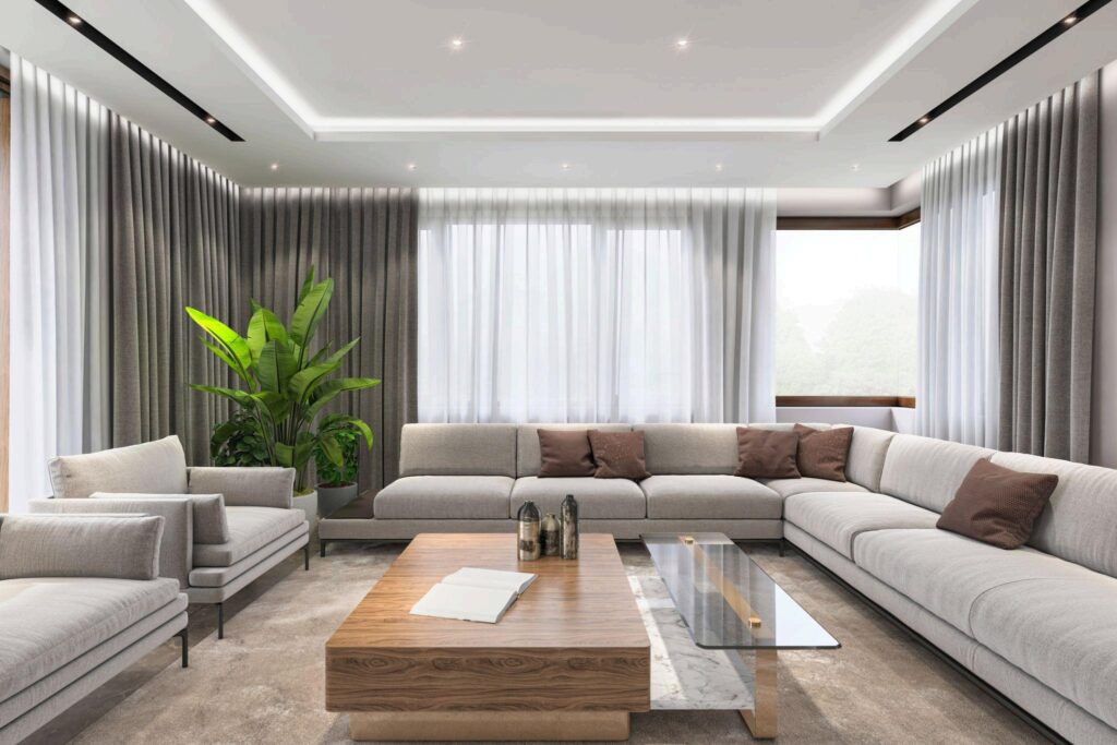
Two essentials of good design include a strong emphasis on form and line. This is what gives the contemporary style its vibe. Rooms designed with natural light and abundant open space in mind will feel expansive and airy. Just make sure every piece you choose to add counts, as there is no room for clutter.
Is this for you?
If you are particularly drawn to the abstract works at art museums, love geometry class at school, have a strong urge to simplify things, are tempted to redecorate everything in white, and feel claustrophobic with heavy curtains, then you know conventional style IS your style!
Note: Contemporary design is characterized by a strong emphasis on working along a horizontal-vertical axis, from furnishings to architecture and considering the structure of the space as a design component on its own.
No, this doesn’t mean that your home should have nothing but square corners. The key is balance. Smoothen the look by adding a few curves here and there. What we want is to stay loyal to the simple geometric forms (waves, orbs, cylinders, and circles). Leave the curlicues and scallops for those who love traditional design.
What Colors?
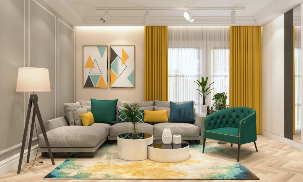
White, black, beige, and cream are the foundations of contemporary design. Tone-on-tone and monochromatic schemes leave room for the shapes and lines in space to become focal points. However, neutral is a rather broad term. Add interest with a shade and undertones, such as gray-blue, or try beige with a hint of gold, gray with some green, or cream with a touch of pink.
Now, if you want a slightly brighter colour, you can always keep it focused on a bold piece of furniture or an accent wall.
How to manage space?
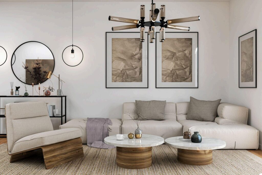
The key element of contemporary interiors is openness, which is why large-scale accents, art, and furnishings are particularly well-suited. In short, contemporary design celebrates what is in the room just as much as what isn’t there! This doesn’t mean that you have to leave a large space with too little to anchor it because you will go the opposite way, and you won’t like the result.
The room will feel forlorn and lost. Better divide up a large room by breaking furnishings into groups. If your ceiling is too high, pendant lighting and chandeliers can help you pull down a cavernous ceiling (visually)
What about the floors?
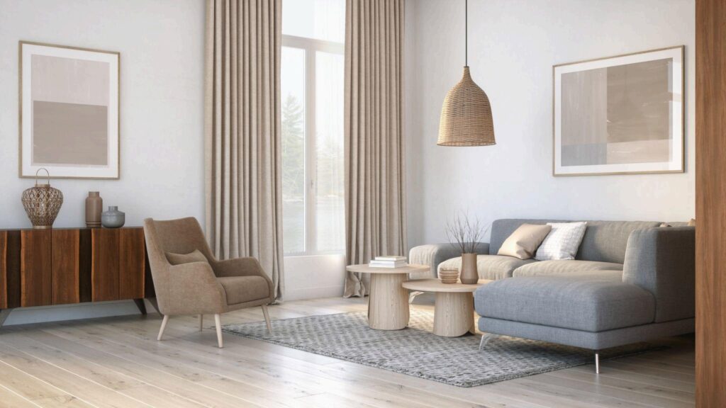
Leave them unadorned. Avoid carpeting and rugs and go for harder (and sleeker) surfaces, such as ceramic, stone, blonde wood (i.e. ash or maple), or bamboo. Dark-stained concrete and Ebonized planks are also excellent flooring types for contemporary rooms, provided you are willing to spend a lot of time with a dust mop at hand.
Of course, nobody says you can’t have a rug in a contemporary home, as long as you pick the RIGHT one. A textural weave, a geometrical design or a grid of carpet tiles might be just the ticket.
For wall-to-wall carpeting, it better go for a very low pile and decidedly a solid colour. Shine and Furniture Contemporary rooms have to be polished with high-gloss surfaces, such as plastic, glass, lacquer, steel, and chrome, that bounce light around the room.
Experiment with different materials to give depth and contrast but don’t go to extremes. Too much reflectivity is something we don’t want, so break up the glam with some matte/honed elements.
As for furnishings, you need striking profiles and clean lines. No slipcovers, no skirts. Just show a little leg without having too many long-legged chairs and tables, or you will make the space feel unsettled and awkward. So, a simple ottoman, a low-slung sofa, or cylindrical end tables will fit your contemporary room just perfectly.
Windows and Accessories
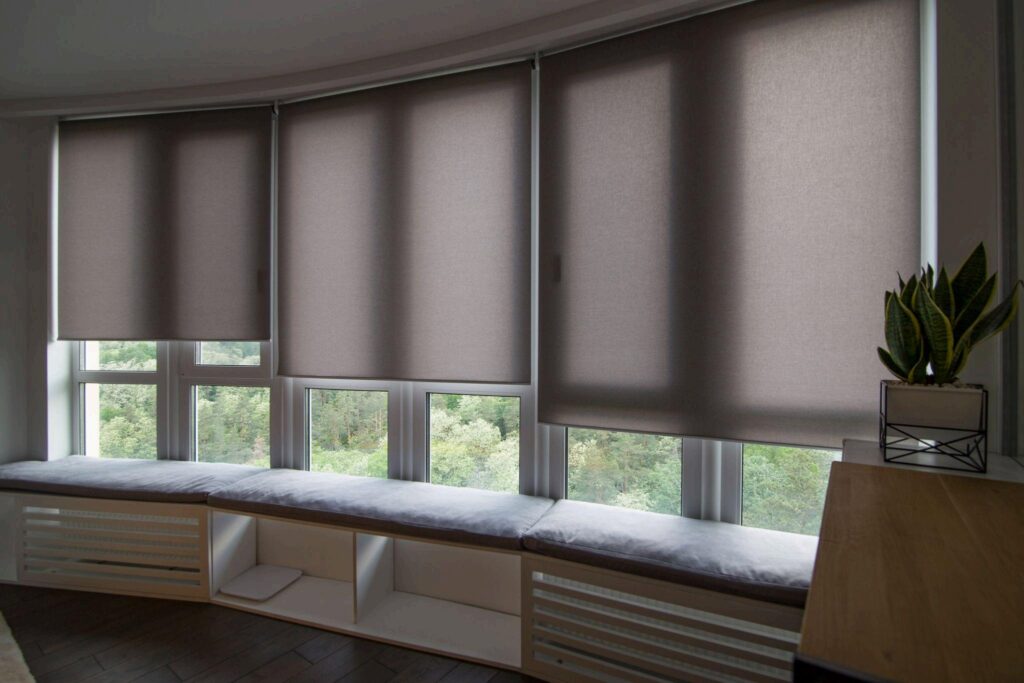
There is no way you can use a balloon valance or tasselled draperies. The crisp lines of the windows are usually highlighted by leaving them undressed and allowing natural light to flow in abundance.
Now, if you want more privacy, solid panels, mesh shades, narrow blinds, and sheers that won’t stop the eye and blend into the colour of the wall are ideal. Just make sure that whichever you choose is kept tailored and is done in a barely-there print (or a neutral solid print). That aside, Roman shades are also great.
Regarding accessories, there is no reason to break the “less is more” rule. Keep away from eclectic groupings, bric-a-brac, and fussy finds. Everything has to be well-chosen and, of course, simple. Nevertheless, you can use simple objects that feel like a piece. For example, glass-fishing-net floats and white porcelain vases are aesthetically pleasing and appropriate as long as you arrange them in a uniform manner that doesn’t detract the eye from the space.
Walls
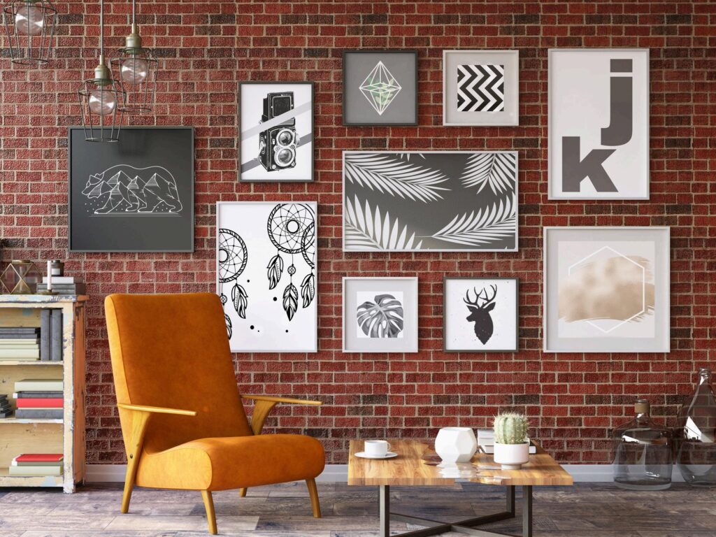
Family photo groupings, plate collections, and heavy mouldings don’t belong in a contemporary room. Large artworks, though, and large (framed) canvases are perfect. Ensure that there is only one accent wall or focal point in the room.
Still have questions and concerns regarding the perfect window treatment for your home? Here is how to choose the right window treatment!
Also, you may want to take a look at ways to jazz up your home like an interior designer! Or do you feel more finding out about the top 10 window trends?
Enjoy!